Week 5 – Polish

This week and the week before it(and probably next week as well) I and the others in the group of Quetzalcoatl have been working on polishing our game. There are still a few things needed to be drawn, such as the third enemy and its ammo and a few animations still need to be added. But, what I was asked by my group to do until the final was to polish up the background and the sign we need for the splash screen.

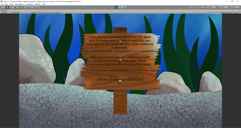
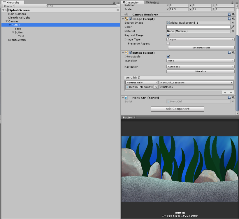
In a previous blog post I mentioned that I made a splash screen in a new scene in Unity, separate from the game scene and the main menu scene. But, we chose to scrap that in favor of a sign that shows up in the same scene as the game to minimize the size. Here is what the splash screen used to look like:

Sign_ withBG

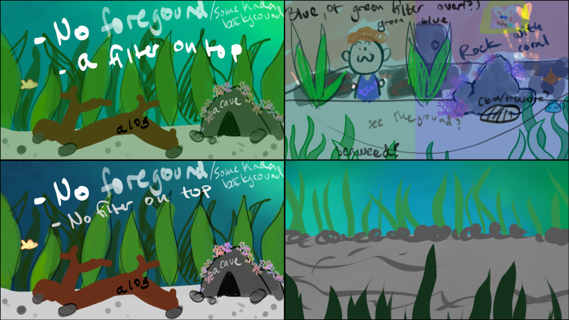
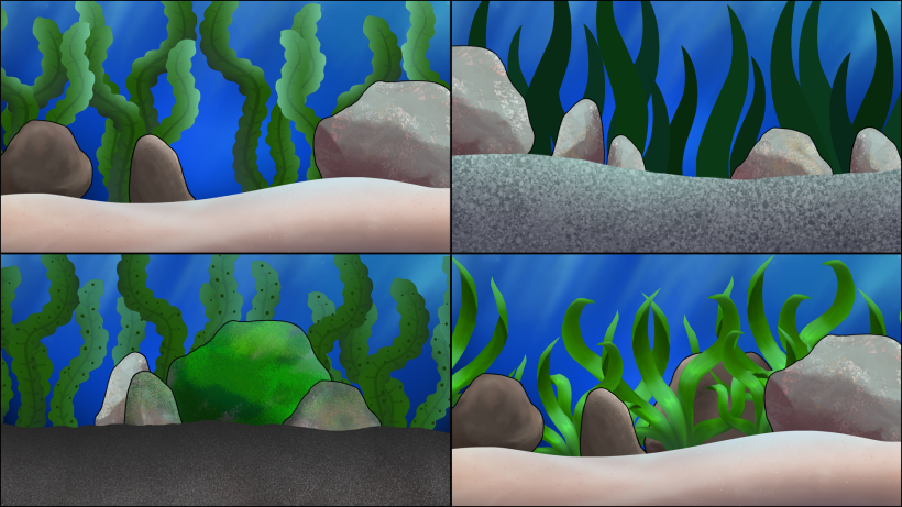
We made the mistake of not setting a clear goal of how the art should look in the game so the art I previously made is a bit too semi-realistic to fit the characters, that are very cartoony and simple in style. Below is our main character(made by Felipe). You can see it does not have any shadows, highlights or any special detail. So, to fit that style we decided to rehaul the art I made. Starting with the sign shown in the splash screen(which is now just a small disclaimer at the beginning of the game). To make it fit in better with the cartoony fishes, I remade it completely in Photoshop. If you hold in Shift while you draw you can create straight lines without much hassle. That is what I used when making the two planks on the front. The pole in the back I made using the rectangle tool.

Main_Character.png
The main character


SignNoTxt.png
The new sign

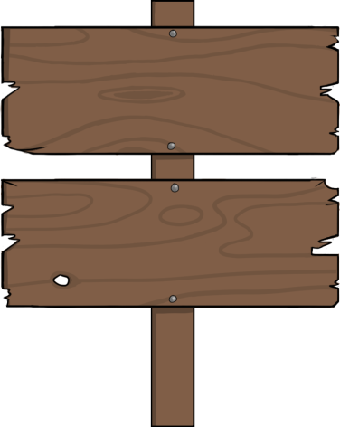
At first, I added text to the sign but then my teammates wanted to change what was written on it. Unfortunately, I had not saved the Photoshop file without the text merged to the boards. So I had to, yet again, remake it. In the future, I will be more careful and save all my progress, just in case.

Week 4 -Redrawing enemies

For this week I’ve been asked to change our enemy fish in our game.

Enemy.png

The first enemy (above) was made by a guy named Axel in our group. This enemy does not do much it just swims straight forward and if it hits you your character dies. But, we got some feedback that it looked too friendly and you felt bad for killing it. Axel was asked to draw something else this week so I was tasked with making the enemy look a bit more evil-looking. To do that I simply made him look angry and gave him some red eyes in Photoshop. I did not have access to the Photoshop file so it was a little bit of a struggle to color without destroying the line art. The result is below. The red one next to him is a place-holder for the second enemy which was supposed to be a swordfish.

Enemy_Angry_1.pngEnemy_Angry_red1.png

But because these did not stand out enough from our blue background I had to change the blue one slightly again. I made some quick color and pattern concepts seen below. The three fish at the bottom right stood out the most. The one we chose to use was the striped one at the bottom right because it stood out the most without changing too much of the original.

new4new5new6new7new9newfishconceptsnew2snew8snew3

After that, I also changed the red one a little bit as to not have it look too bland next compared to the blue one. Because the red fish follows the player around and chases them it felt better to have it stand out too. You can see the result below.

Enemy_Spotted1.png

When the designs were done I had to alter the animation frames that Axel had made before. See below:

enemy_spotted1enemy_spotted3enemy_spotted2

enemy_stripes1enemy_stripes3enemy_stripes2

When all the designs were done I had to put them into our Unity project. First I made each of the fishes animations by dragging the images to the scene and saving them in our animation folder. Then I went into the enemy prefabs we already had and changed the sprite to the newly designed ones. Then lastly, I added each of the fish animator controller files into the animator controller in the prefab. The screenshot bellow is the prefab for the red enemy when it is turning left.

Animationer.png

Week 3 – Making a splash screen

This week I’ve been working on a splash screen for our game called Selfish. We had received feedback for our game that it was hard to tell why the main character fish was shooting the other fish in the tank. So, our designer came up with the idea that we could have a splash screen with a sign that briefly tells the story. A splash screen is usually a screen at the start of a game that tells you what company made the game. But we decided to write a short backstory there instead.

Since the game takes place in an aquarium we thought that it would be fitting that the text should be written on a wooden sign that is sometimes placed in fish tanks. The sign was made in Photoshop. First I made the outline of the sign. Then I made the wood texture in Photoshop as well using a few different filters. Lastly, I drew some quick nails on it. When I drew the sign there was not yet a text to put on it. So in retrospect, it would have been better to design the sign after I had the text to make it fit better. I’m also not very satisfied with the look of the texture. Our visual goal is something more cartoonish and the sign came out looking a bit too realistic. I also don’t like the blue light effect I put on the top right. If I have time, I will remake it later.

Player splash screen.png

When I had made the sign I started to make the splash screen for the game. To do that I asked our programmer for help. I went into Edit>Project Settings>Player. In the inspector, I added the sign as the logo and a background I had made for the Pre-Alpha as the background image. For the player to have time to read the sign I set the time to 10 seconds. This screen will play when you build the game and play it. However, it is not skippable, which in my opinion is quite annoying. So, I thought that it could be smart to make the sign into a separate skippable scene instead.

Splash screen.pngMenuctrlthingy.png

I am not very gifted in Unity, at least not yet. So, I improvised a little bit while making this scene. I wanted this scene to appear at the start of the game and when you click anywhere on the screen it would take you to the main menu. That way, you can decide yourself if you want to read the sign or not.

I first made a canvas to be able to make a GUI. Then I added two buttons as children to that canvas. For the top one, I added the Pre-Alpha background as the image and for the bottom one, I added the sign. I removed the “button” text on both and resized them to fit the screen. Then, I copied a script called “Menu Ctrl” from our main menu that has clickable buttons. I believe this is the script that allows you to change scenes when clicking on buttons. After that, in the “Button (Script)” tag I made it so that a click would take you to the main menu(“StartMenu”). I did the same with the sign button, except in that tag I did not need to add a script, I suspect that is because it is the child of the top button with the script already added(I don’t really know if that’s why…). Lastly, I turned the “Transition” to “None” to get rid of any blinking when clicking on the screen.

There might be an easier way to do this but it worked. So in the end, I am proud of my splash screen(not so much splash screen anymore, though).

Week 2 – Backgrounds

Bakgrunder 2.png

A couple of weeks ago I was asked to make background concepts for our Selfish game. Since it is a game about a fish in an aquarium I first drew some quick suggestions on how the aquarium could look. Above you can see some of my concepts I made in Photoshop and PaintTool SAI. The pictures on the left are the same picture except the one above has a green filter over it. I thought it would look more like you are underwater if that was implemented. However, we opted not to use that. The one on the top right was a bit too clustered to work, it would make it hard to follow the gameplay with so much going on behind you.Bakgrunder.png

We decided that it would be easier just to make a background in Photoshop and then add artifacts of different kinds, to make it look like an aquarium, in Unity. That way we could easily redesign the scene if we wanted to. I’ll write about the artifacts I made in a different blog post. The backgrounds I made are seen above. The two top ones are the same picture with different coloring. All of these are made in Photoshop except the one on the bottom left, which was made in SAI, but I was not pleased with that one so I switched medium. I was told to make the bottom darker and the top brighter to give the impression that the aquarium is deep. In my opinion, they look more like drawings of the ocean than an aquarium but my group was happy with the first one on the top left so that is what we’re using currently in-game.

Bakgrunder 3.png

I also had the task to put together the background in Unity, above you can see some suggestions that I made. I also created some foregrounds that are not in the pictures right now. I am not good with Unity yet so we opted to use a different background than the ones I made. In the future, I plan to remove the line art from the rocks as I think they stand out a bit too much.


Week 1 – Making bubbles

Player_Bubbles.png

I work in the group Quetzalcoatl and we picked the game concept Selfish. In that game, the player character is a fish in an aquarium with a gun. A “bubble gun” to be specific. I was tasked with making the concept for the bubbles for said gun.

The image above was made by me 2 weeks ago. The bubbles over the middle of the image were made in PaintTool SAI but it was hard for me to make them look good so I switched to Photoshop and made the bubbles at the bottom of the picture which I am more pleased with.

I tried to make as many different combinations as possible. I drew different size of line art around the bubbles and I also made the line art in different colors. I also painted several different highlights to see which would look best. The bubbles on the bottom right are concepts I made for bubbles that could perhaps be added in the background of the aquarium if we get time to add them.

The background is blue so I could picture what they would look like in the water of the aquarium. But, I made everything on separate layers so that I can easily remove the background and make the bubbles into sprites if we want to use them in the game.

Enemy_bubbles.png

Early on in our sprint meetings, we discussed having the enemy fish shooting bubbles back at the player. So, along with the player’s bubble concept I also made a bubble concept for the enemies’.

I thought that the bubbles should be similar to the player’s but slightly different so that you could tell a difference between them. The bubbles on the left on the picture above I copied from the player bubble concept PSD file and changed the colors and the highlights.

As you can see most of the bubbles are either reddish or with a red line art. I chose to paint them like that so they could stand out from the blue/green background but also to differentiate them from the player’s. Some of the bubbles are also darker, I thought it would look good for them to be the opposite of the lighter bubbles the player shoots. But in my opinion, they ended up looking like oil drops instead.